Research & Concept
The idea for this font originated in nature, by looking at the universe and world around me and drawing inspiration from that. To get the process going, I started out by drawing little doodles of things that inspired me, and since I was currently enrolled in an Astronomy class, a lot of my inspiration came from outer-space. From there I began drawing stars and planets and eventually found myself sketching the different phases of the moon and Venus. I then took this inspiration and decided to create a design that mimicked the changing illumination of the moon with a font that had a heavy contrast between thick and thin.

“Bely” Designed by Roxane Gataud

I also did some research on other type designers to get inspiration from their work and learn about their process. I read different blogs and searched several websites to read about all kinds of type designers, but one person who really stood out to me was a designer named Roxane Gataud. What was inspiring about her story was that prior to designing her award-winning typeface “Bely,” she had absolutely no experience in font design or vector drawing. As a type design beginner myself, this was a wonderful story to read before I got started. Some of the things I learned from her and her process were that you should start out by experimenting a lot to find out what works and what does not. Since it is a learning process, she emphasized the importance of staying open to new ideas, taking advice from others, and knowing that it takes awhile to get your design perfect and you’ll want to change little bits of it all the time.

SKETCHES
After I had done my research and established my concept, I continued sketching pictograms and then basic letter forms. I experimented with several different directions of astronomy and moon phases, but eventually came across one design that stood out as the one I wanted to develop.

Preliminary Design
Next, after I solidified my design concept, I took my sketches and drew them on graph paper. I established my baseline, x-height, and cap-height and drew each letter accordingly. Since I had done a lot of planning, this step was relatively painless and I enjoyed sketching out my letters to see the beginnings of the design start to come together.


Development
After I finished hand-drawing my letters on graph paper, I took those sketches to the computer. Using Adobe Illustrator, I traced over each of the designs with the pen tool and began creating the outlines of the letters. I then began experimenting with different shapes for the thickened parts of the letter. Once I found a thickness that I liked, I replicated this shape for all of the letters. Thus, all of the strokes for both the uppercase, lowercase, numbers, and glyphs would be uniform. One issue I had to deal with during this process was what to do with the curved letters. Originally, I had planned on “filling in” half on each of the curved letters; however, when I did that those letters appeared much thicker than the rest of the other letters. Instead, I ended up making those fills less wide so that way the typeface felt more cohesive. Throughout this design process, some of the other letters I struggled to develop were the uppercase and lowercase “s” as I tried to get a perfect curve while making the letter seem balanced, the lowercase “f,” “g,” and “j” trying to figure out how to combine the straight stroke with a curve, and the “w” because it is the widest letter. Overall, I enjoyed the development process because it was satisfying to be detail-oriented and develop each letter to perfection.

Final design & Rendering
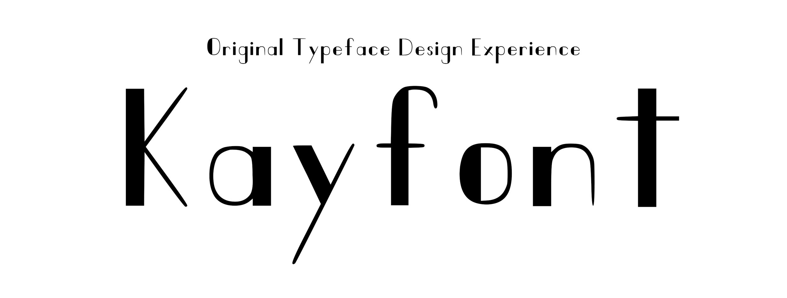
Once I had perfected every detail of my typeface, it was ready to be rendered into a usable font. This was the most rewarding yet frustrating part of the process. First, it was pretty difficult to find a program that could be used to convert the font. I experimented with the program FontForge, but it was pretty touchy, and I couldn’t get the font to export right. Therefore, I had to go with a back-up program called Callgraphr, which is an on line typeface generator. Although it is meant to be for people to turn their handwriting into a font, it worked pretty well for a digital typeface. The only frustrating part of this was that I had limited control once it was in the program. I could make minor adjustments to the letters but some of the letters still didn’t render quite right. I ended up having to render this design multiple times paying attention to little details within each letter and going back and forth between the rendered type and the type program. However, once I got these details relatively solidified, I felt like the typeface ended up looking really good. Although not all of the letters are exactly perfect, it came together well. The most exciting and rewarding part of this process was seeing how it all came together and then being able to actually use the font that I designed. It was fun being able to open up a word processing program, select my font, and begin typing with it. Overall this was a challenging, exciting, and incredibly rewarding learning experience, and I thoroughly enjoyed it.

KAYFONT IN USE
After I completed my typeface design. I got to put it to use in a magazine spread design. To honor the origins of my typeface, I decided to design the spread revolving around the idea of astronomy and stargazing. Thus, I wrote and designed the article: A Beginner’s Guide to Exploring the Universe.
